Google Upgraded Its Mini Data Visualization App
Data GIF Maker's glow-up is good news for students and teachers.
Trigger Warning: This post has four animated GIFs with plenty of motion. Please tread carefully if that triggers you.
In March 2019, I wrote about Google’s Data GIF Maker. I argued it was a useful web-based tool to help students and teachers tell stories with small data sets. As a former history teacher, I thought the app was perfect for depicting Electoral College results.
I am pleased to share that Data GIF Maker has received its glow-up.1 The new site’s upgraded features make it a fun and easy way to visualize small data sets.
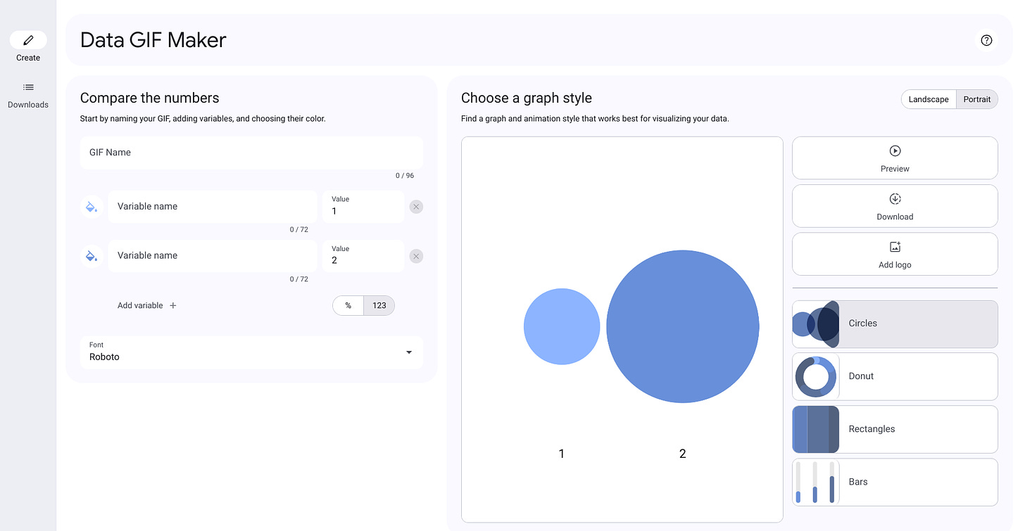
I see value in talking to students about why they chose a specific graph style to visualize a small data set. Data GIF Maker is a simple tool unlike Google’s other data visualization app, Looker Studio.
Upgraded Features
The new Data GIF Maker has several upgrades including:
More Graph Styles and Variables
Data GIF Maker now has four graph styles: Circles, Donut, Rectangles, and Bars. The previous iteration had three styles. Two had a maximum of four variables. The maximum for rectangles was three. Now, all four graph styles have a maximum of five variables. Switching between graph styles does not erase data.
More Colors
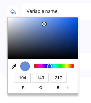
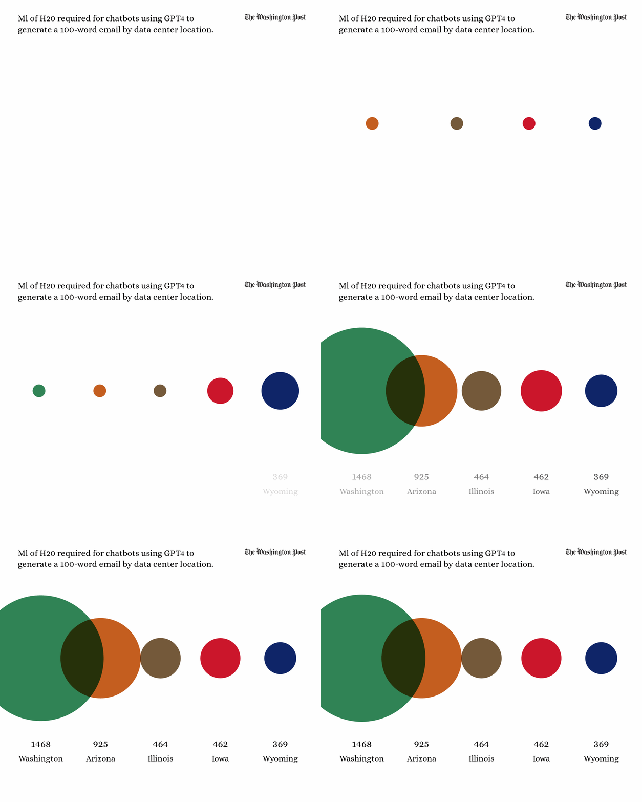
Previously, there were just seven colors available for each variable. Now, you can use any web color. There is a color dropper to grab any color. I used this to pick colors from other windows and screens. For example, the Circles GIF below has colors picked from state flags.
Portrait and Landscape
Data GIF Maker now has portrait and landscape options. Portrait is perfect for Instagram and TikTok. The GIFs in this post are landscape. Switching between the two does not erase data.
Add a Logo
Add a logo to the upper-right corner of a GIF. I used logos from Wikipedia in the four GIFs in this post.
Fonts
There are now nine font options. The previous iteration did not give users an option to change the font. Each GIF in this post has a different font.
High-Quality Downloads
GIFs can be downloaded as low or high-quality GIFs or as high-quality MP4s. I downloaded the GIFs in this post as high-quality GIFs. They rendered nicely, but each was less than 1 MB.
Example GIFs
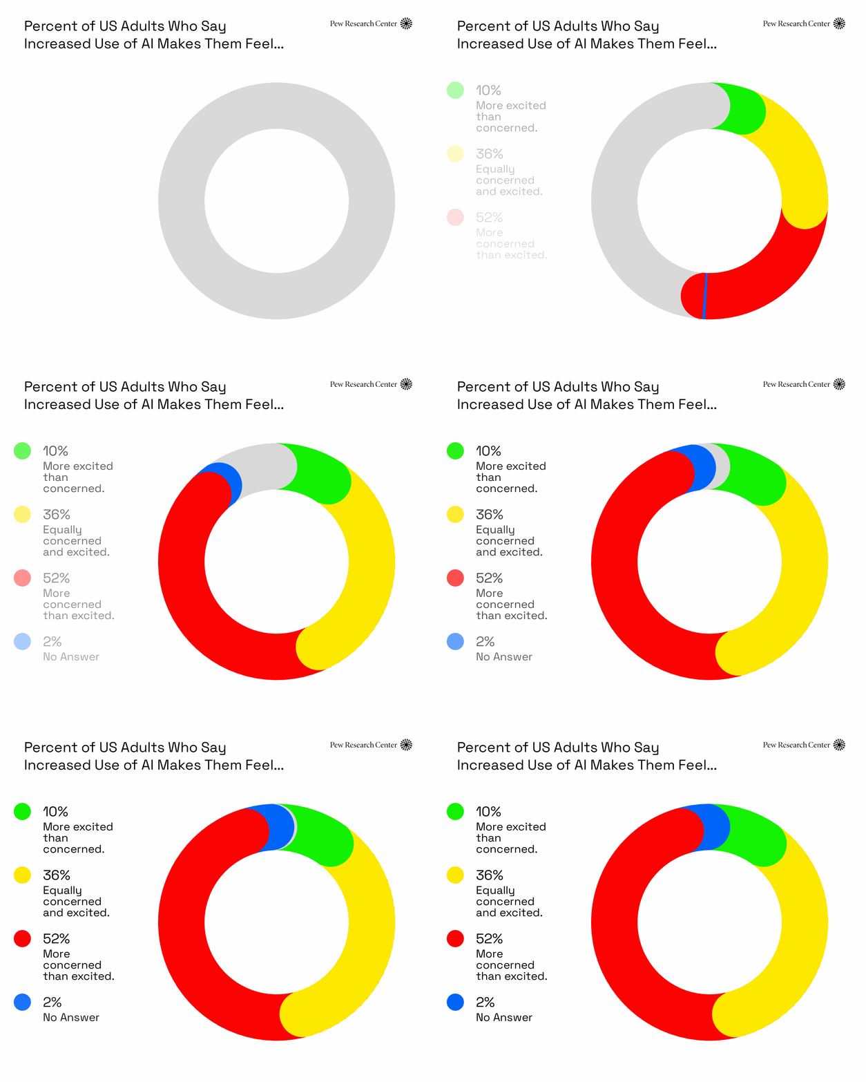
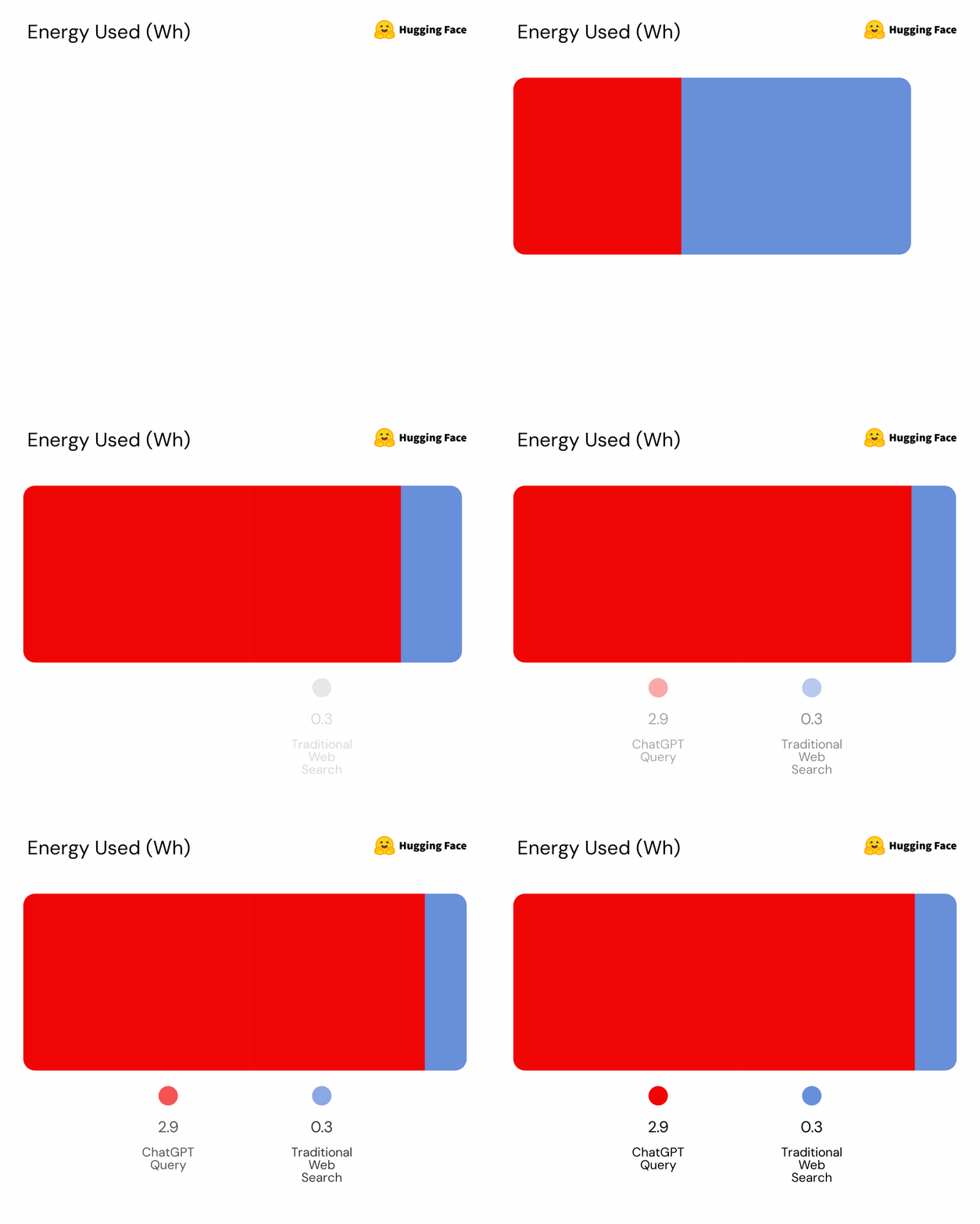
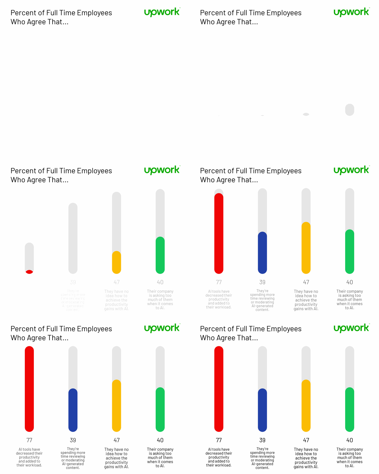
Here are four GIFs I generated with small data sets.
Circles
Donut
Rectangles
Bars
I am pleased with the upgraded Data GIF Maker. I have two suggestions for improvement.
I want more than 96 characters to type the GIF name. That limit forced me to be creative with the title of the Circles GIF above.
The ability to paste a Hex code should also be more conspicuous. It took me a while to figure out that I could click the tiny toggle arrows in the color picker to paste a hex code.
Besides that, I highly recommend trying Data GIF Maker to visualize small data sets.
Continuing The Conversation
What do you think? How are your students creatively visualizing data? Comment below or Tweet me at @TomEMullaney.
Does your school or conference need a tech-forward educator who critically examines EdTech, AI, and pedagogy? Check out my professional development offerings, reach out on Twitter, or email mistermullaney@gmail.com.
Post Image: The post image is Materials on a Straw Carpet by Monstera Production from Pexels. I edited the image with Procreate.
AI Disclosure:
I wrote this post without the use of any generative AI. That means:
I developed the idea for the post without using generative AI.
I wrote an outline for this post without the assistance of generative AI.
I wrote the post from the outline without the use of generative AI.
I edited this post without the assistance of any generative AI. I used Grammarly to assist in editing the post. I have Grammarly GO turned off.
There are no generative AI-generated images in this post.
Critical Inkling is a reader-supported publication. To receive new posts and support my work, consider becoming a free or paid subscriber.
It’s nice to write something not centered on “AI.” I may have incorporated “AI” into the GIFs I generated for this post.





I made a video showing how to get more than 96 characters in the GIF title! https://youtu.be/tmgHkMvuuhw